
Tags
3M, cellophane, cellulose, dispenser, magic, scotch, tape, transparent, vintage
In 1930 a young engineer from 3M by the name of Richard Drew invented cellulose, also known as invisible, adhesive tape. Two years later the first “scotch” tape dispenser is introduced to the world.
Now, it should be noted that back then there were different types of tape already on the market much as there is today. And there were also tape dispensers of various types that were introduced prior to 1930. These dispensers though would have been more specialized and designed for specific types and makes of tape. The dispenser introduced by 3M in 1932 could be considered the first standard dispenser and would be recognizable today as an adhesive tape dispenser.
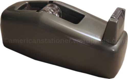
Today’s vintage item is the 3M Scotch brand model C-20 Deluxe Tape Dispenser. This was introduced sometime between 1952 and 1954, but most likely in 1954. It was sold at least through 1974 and probably a few years afterwards. The C-20 is a redesign of Scotch’s venerable model DD-1 (desk dispenser model 1) which was introduced around 1938. While the DD-1 had more of an art deco design the C-20 took on a more mid-century modern look.
The C-20 weighs 2 pounds 7 ounces empty. It measures 6″ L x 2.5″ W x 2.75″ H and has a one inch core. The core is the piece of plastic that you place in the center of your roll of tape so that it will be held securely in the dispenser and enable the tape to rotate freely. In the picture above note that the core that came with the C-20 was clear plastic.

original box that the dispenser pictured above came in
Now, I can tell you with a fair amount of confidence that my C-20 was made in 1955. However, I can also tell you that nowhere on either the box or the dispenser itself is there any mention of a date. No codes, no serial numbers, nothing that directly identifies the year it was made. And of course, why would it? It is just a tape dispenser, nothing more than an office tool.
So how does a person determine when something like this was made? Why my dear Watson, through deduction!
Let’s start with the box.

This is the end flap of the box pictured above. And while there are no dates here there are a number of clues available. Note that I’ve circled four specific items. Let’s look at these in order.
- Scotch Brand – 3M used slight variations of its “Scotch Brand” logo throughout the years. With a bit of research using office supply catalogs, advertisements, etc. I’ve come up with the following:
figure 1

1930 to 1946
figure 2

1946 to 1952
figure 3

1952 to ~1961
figure 4

1961 to 1968
figure 5

1968 to 1977
Figure 1: This is the word “Scotch” only and it is in quotation marks. The typeface used is a very simple and straightforward sans serif. The letter “S” is approximately three times larger than the remaining letters. The remaining letters “cotch” are centered vertically on the “S” and are in lower case. The font, letter weight, and even the letter coloring differ greatly from what follows later. This is one of the easiest to identify. This style was used from approximately 1930 until 1946.
Figure 2: Starting about 1946 you see the word “BRAND” added to this logo. You will also see added “REG U.S. PAT OFF” which means the brand is now registered. They’ve also stylistically changed many things. The typeface is still technically sans serif but with the slightest of flairs at the ends of the “S” and the “C”. The letter weight has also been drastically increased. Furthermore, while the “S” is still the largest part of the logo, it is now only about 25% larger than the remaining “cotch”. The “cotch” portion is also in all upper case letters and is no longer vertically centered on the “S” but instead is aligned with the bottom of the “S”. The word “BRAND” and “REG U.S. PAT OFF” are now centered horizontally below and above the “SCOTCH” and are both the same size at about 25% the size of the “S”. This style was used from approximately 1946 until 1952.
Figure 3: Starting about 1952 we start seeing some subtler changes. The typeface and letter weight stay the same, but the “cotch” portion of the logo is again centered vertically on the “S”. The relative size of the “S” also increases to approximately 150% the size of the remaining portion of the logo, the “cotch”. Note that the flairs at the ends of the “S” and “C” are slightly more pronounced also. There are two other subtle changes. The size of the word “BRAND” is increased while the size of the words “REG U.S. PAT OFF” is decreased relative to the “Scotch” portion.
Figure 4: Starting around 1961 we see a much more noticeable change. Namely, the word “BRAND” now enjoys the same height and letter weight of the “cotch” portion of “Scotch”. The “cotch” portion is now not quite vertically centered on the “S” as seen in the past, but instead is approximately 25% below being aligned with the top of the “S”. The subtle flairs on the ends of the “S’ and “C” are now almost gone. While not universally used at this time, note the drastic color change to red. This version was used from about 1961 until approximately 1968.
Figure 5: This is when 3M started getting serious about branding. Note the drastic font change to “plumber industrial” to match the style used in their logo of the time. The letters are all bottom aligned and in title case (first letter capitalized, following letters in lower case). The “REG U.S. PAT OFF” has been removed. I’ve found this one used from approximately 1968 until 1977, but I consider it very likely it would have been used at least sometimes in earlier years, but no earlier than 1961 when the matching logo was introduced.
There will be overlap with the dates above as office suppliers, stores, catalogs, etc. slowly updated their graphics and pictures. Also, and it’s just as true today, sometimes items are overstocked or whatnot so older stock (with corresponding older packaging) will be sold alongside newer stock. What I’m saying is use the above figures as a guide and not necessarily as the final arbiter of dates.
- Cellophane Tape – People today are so used to calling all tape “Scotch Tape” that they don’t realize they are even using a brand term. However, as with many things this was a term that changed slowly over the years. The following terms were used by 3M for its Scotch brand adhesive tape:
- CELLULOSE TAPE – 1930 to 1952
- CELLOPHANE TAPE – 1952 to 1961
- TRANSPARENT TAPE – 1961 to 1973
- MAGIC TRANSPARENT TAPE – starting approximately in 1973
You may also see the term on packaging “Magic Tape” (without the “transparent” addition). While Scotch tape was called “magic tape” for a while I find no evidence of it being used widely on packaging until after 1973.
As with the “Scotch Brand” logos, there is some overlap and it will be for the same reasons. Again, use this information as a guide. I wouldn’t consider it definitive but will get you “in the ballpark”.
- The 3M logo. The Minnesota Mining & Manufacturing Company used a number of logos over the years and until around the 1960’s didn’t control it too much. This meant it was not unusual for one type of product to use a slightly different version of the logo than another product. The 3M logos are considered a standard item to study for design students. As such, there is much information to be found about their logos. Suffice it to say that the logo used on the box is from 1954 whereas the logo used on the “How To Use” pamphlet included with the dispenser shows the logo from 1955.
- The address. One way to use an address to determine dates is if you can determine the different locations a company was residing in and during which years they were there. That’s fairly straightforward logic. However, in this case, look closely at the box. It states “ST. PAUL 6, MINNESOTA. The “6” is what we’re looking at. This is what is known as a city postal zone code which was a precursor to zip codes. Postal zone codes were used from 1946 until zip codes were introduced in 1963.
So, using the information above in relation to my C-20 what can we come up with? Using the box side in order of notation:
- The Scotch Brand logo on the box was used from 1952 until the late 50’s/early 60’s.
- The term “cellophane” tape was used from 1952 to 1961.
- The latest logo was used for a very brief time – 1955
- The use of postal zone codes for a city dates from 1946 to 1963.
If we discount the logo, we are able to determine a time period of 1952 to 1961 for the dispenser. The logo on the box means the box was printed in 1954 but the instruction pamphlet included was printed in 1955 according to the logo used there. Therefore, I can confidently date this to 1955 making it a first generation version of the C-20 dispenser.
It should be mentioned that there are other clues as to the time period this was available. The mid-century modern redesign, the colors, type, and design used on the box all would also point to a time period from the 1950’s or 1960’s.
EPILOGUE
As is likely obvious I’m the kind of person who is passionate about collecting office items. But even I have to admit that I find tape dispensers to be rather unexciting. They aren’t particularly mechanical, essentially have only a single use and are rather uninteresting in design. So you may be wondering why I went through all this trouble. The answer is because I want to show new collectors or those who are simply interested how to closely look at the clues, compare the information, double-check it against other sources, and show how to research for themselves the history of an item that is of interest. Furthermore, note how I avoided even talking about patents. Patents can provide great information but they can also be misleading if you don’t understand how to use the dates on one. You see this on the internet all the time; a person will try to sell an item stating that it was made in say, 1932, because that’s when the patent is dated. However, even the most cursory internet search will tell you that the item was more likely made in the 1970’s, 1980’s or even still being made. When researching, as much as possible you must look at all of the information, not just the “easy” information, and you must not be fooled by superficialities such as how dirty or clean an item is. The model C-20 Scotch Tape Dispenser is a great example of how to use various clues on the item and the packaging to determine the time period it was available.
Other Information:
Notes:
- Utility Supply Company Catalog (1946), Chicago, IL page 410
- Latta’s School Supplies (1948), Cedar Falls, IA, page 16
- Upper Des Moines Office Supply Department (1950, June 28). advertisement, Algona-Upper Des Moines, page 7
- Upper Des Moines Office Supply Department (1950, April 4). advertisement, Algona-Upper Des Moines, page 7
- H. Pence Co School & Office Equipment Catalog (1952), Richmond, VA, page 86
- Utility Supply Company Catalog (1952), Chicago, IL page 97
- Commercial Stationers and Office Outfitters Catalog (1955), Chicago, IL, page 246
- Grand & Toys Office Supply Catalog (1962), Don Mills, Ontario, Canada, page 5
- WOSCO Catalog, (1963), Greensburg, PA, page 33
- The Hearne Democrat (1968, October 3). advertisement, The Hearne Democrat, page 27
- Union Paper and Supply Co Catalog (1974), Wilkes-Barre, PA page 83
- 3M, About Scotch Brand. Retrieved November 2, 2015 from http://www.scotchbrand.com/3M/en_US/scotch-brand/about/?WT.mc_id=www.3M.com/brands
- Cotter Visual Communications, A Visual Brand Reveals the Company History. Retrieved November 2, 2015 from http://cottervisual.com/a-visual-brand-reveals-the-company-history/
Visit me at http://www.facebook.com/americanstationer.
